Hi moley mates, I'm sorry that I've been a bit tardy in posting this moley.
Casey's moley arrived safely in a very wet and miserable Belfast on Tuesday, and now on Sunday evening I have time to really enjoy it's contents.
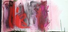
Casey started the "Freedom" theme with a lovely freeform expression of colour and texture in soft pastel. Casey did you use Unison pastels for this?, because if you did I'm beginning to see why they are so popular among soft pastel artists.
Then Lindsay threads some of Casey's colours into her dynamic mixed media landscape, using oil pastels and solid blocks of colour. I'm going to have a go at using oil pastels, I love the almost liquid effects that Lindsay has achieved with these.
Next, Brian's interpretation of "Freedom" introduces us to a very serene scene in soft pastels of a disused jetty, with lovely soft waterery effects and what I think is becoming Brian's trade mark greens.
So, what will I do?
I think that I will continue the pastel tradition already established in this moley, however as to subject. Well we will see.


7 comments:
I think this is a cunning use of pastels in Brian's work. Love the abstracted idea and angle.
Lor Lor, I used a red Uni or two, but the rest of the red and the gray are my own self-made pastel sticks.
Thanks for your kind comments, Lorraine and Casey. And thanks for posting the photo, Lorraine - you managed really well with it; I was afraid the drawing would look like one big gray-green mess in a photo! Have fun working in Casey's book!
It's really beautiful and rhythmic brian. That green is lovely.
I'm going to get some Unis this week and step out of my oil pastel routine! Can't wait.
mmmmm I agree
I love Unisons, so rich and luscious
I want a book!!!!!
great pastel work, brian. in particular the handling of the water surface. very nice! very much looking forward to this one!
vivien, patience ;) - am starting to think about the maps/destination theme. not clear yet, though...
It's taken me a while, Brian, to come to an understanding of what you have done here. I've looked, and looked, and looked, and what I now appreciate is that not everything needs to be 'crash, bang, wallop' and can, in fact, be more subtle. I'm not good at subtle but I begin to see hidden depths with a light hand caressing the water surface with just enough of a ripple to disguise the fly as it lands on the surface.
Beware unsuspecting trout for you will not be FREE much longer!
Thanks very much for your comments, everyone!
I appreciated your thoughts David. I've begun to realize that I'm very much drawn to art that suggests something but leaves much to the viewer to complete - saying something gently and leaving lots of space or room for the viewers response. I was thinking about this while looking at the big Turner exhibit here in New York City at the Metropolitan Museum - it explains why I spend most of my time staring at his nearly abstract watercolor studies as opposed to the larger, highly-detailed oils and watercolor paintings.
Post a Comment